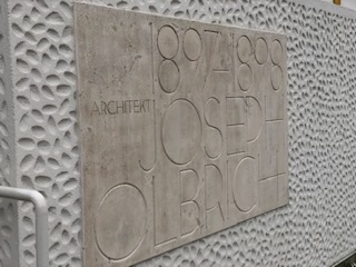
The buildings that I have seen and experienced this week were built during the period of the Secession. These buildings stray away from the grand, striking decorations and ornamentation that the previous architectural movement in Vienna represented. The buildings created during the Secession were more focused on their purpose and structure, rather than their appearance and decorations. The Secession Building by Joseph Olbrich is a perfect example of the architecture during this time.
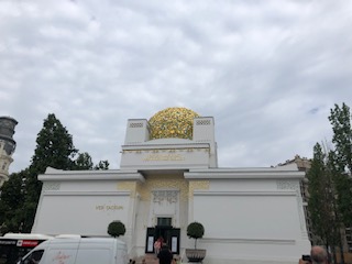
I spotted this building from far away because it’s beautiful gold dome is difficult to miss. This gold dome has floral ornamentation and looks absolutely stunning against the white paint on the building. White and gold are the only two colors that make up this building.
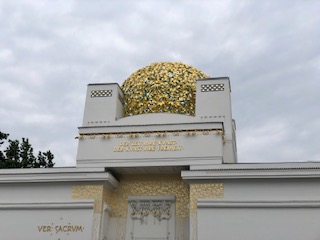
The details of the decor are very intricate, but these decorations mostly only exist on the front of the building. The rest of the building keeps it’s plain white color which I think looks very sleek and simple. The floral decorations are very modern looking and to me resembled the start of a new age of architecture. Although the beautiful gold dome has a striking appearance even from far away, it is the main focus of the building and does not overwhelm the overall appearance of the structure.
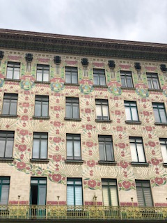
The coloring on the Majolikahaus caught my eye after exiting the market. The beautiful flowers that are engraved on the building are a simple decoration that adds life and color without being overly dramatic and distracting.
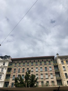
The building keeps a uniform square shape with square windows that do not have anything protruding from the building. I really enjoyed visiting this building because of it’s subtle beauty and color that do not distract people from it’s purpose of being an apartment building.
The Raiffeisenbank is another great example of the simplicity of the architecture during this movement. It is interesting because it is right next to the Hofburg, which is a magnificent and impressive looking palace. However, this bank is almost easy to look past because of how plain it is compared to the Hofburg.
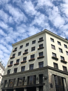
It has a simple square façade. It’s only decoration are boxes of flowers under some of the windows. It is obvious that this building’s priority is to serve as a bank, and not as a beautiful appearance for the public eye. It was a little unexpected to see that inside it is very sophisticated and dark compared to it’s brighter façade. The inside is all mahogany along with gold details and emerald carpet.
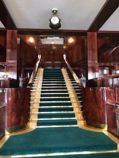
To me, the nicer interior shows that the purpose of the bank and making the customers feel comfortable while inside is more important than what is going on outside the building. These buildings were strikingly different than those that I saw that were built from the previous architectural movement. Purpose has become a top priority for these architects while still maintaining an excellent appearance.
